Client project · Shopify
Organic Shilajit UK: a cleaner, more trustworthy Shopify store
Organic Shilajit UK sells Chitrali shilajit resin, drops and a small range of natural products. The redesign addressed confusing product choices, sparse information and friction on mobile. The work covers a new theme, a clearer homepage, more useful product pages, trust information and the buying journey.
Free first review · Practical recommendations · No obligation

Project at a glance
- The problem
- Make the range, product sizes and supporting information easier to understand.
- What we delivered
- Shopify homepage, collections, product choices and mobile buying journeys.
- Key decision
- Group resin sizes into one product choice and place relevant evidence beside the buying decision.
- Client
- Organic Shilajit UK
- Sector
- Natural products, online shop
- Platform
- Shopify
- What we did
- Shopify storefront UX, homepage and product-page architecture, mobile buying, content and on-site SEO
The problem
Shoppers could not tell what to buy, or why to trust it.
In this category people are cautious. They want to know what is in the jar, where it is from and whether it has been tested before they spend £30 on a jar.
No first message
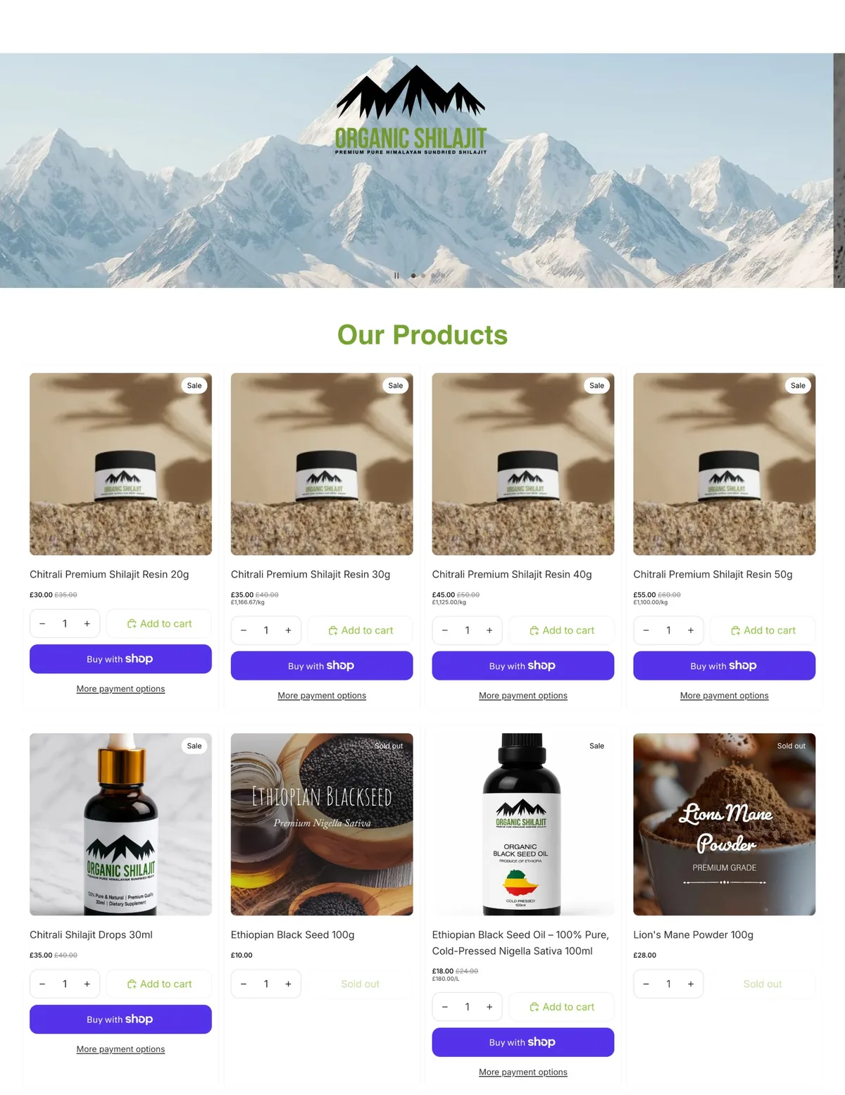
The homepage opened with a logo on a mountain photo. Nothing said what the shop sold, where it came from or why to buy here.
A crowded product grid
Four resin sizes were listed as four near-identical products, each with two different buy buttons, next to sold-out items.
Thin product pages
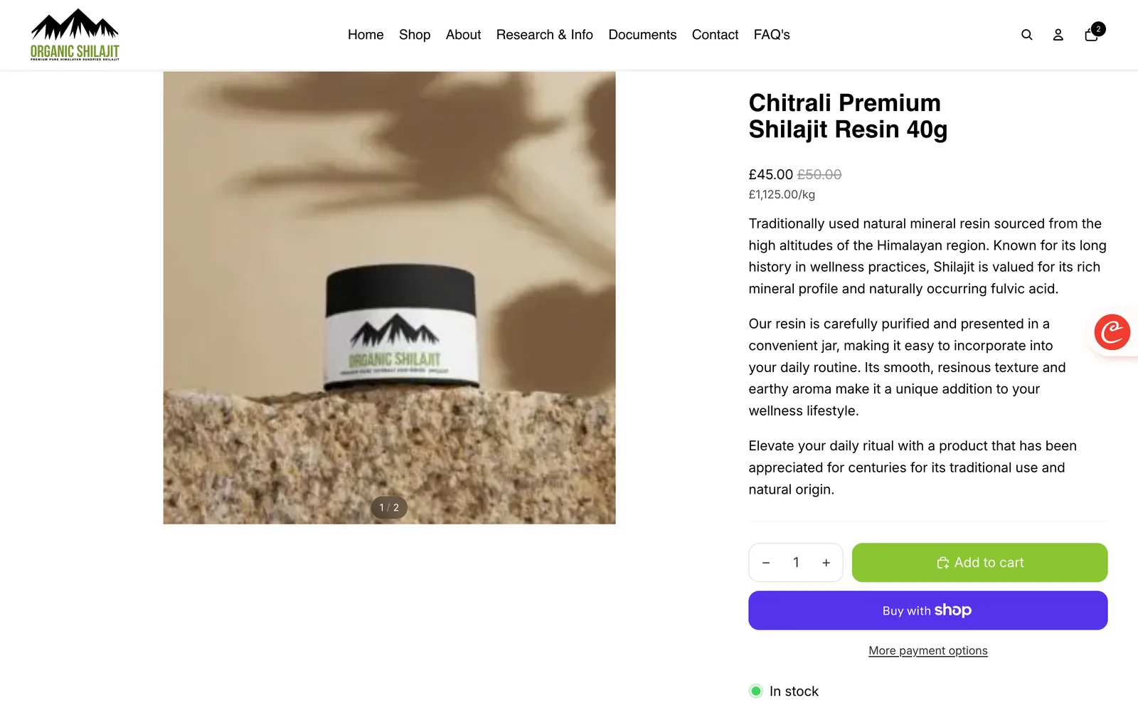
Product pages had a few lines of general copy. No ingredients, no specification, no testing documents and no delivery information.
Homepage
From a logo banner to a homepage that sells.
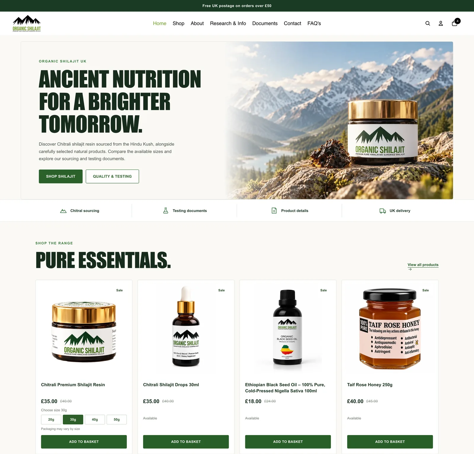
What changed on the homepage
Every section now has one job.
- A headline and a reason to stay. What the shop sells and where the resin is sourced, with two clear choices: shop, or check quality and testing.
- A trust bar under the hero. Chitral sourcing, testing documents, product details and UK delivery, visible before anyone scrolls.
- One product, four sizes. The resin is shown once with a 20g, 30g, 40g or 50g choice, instead of four lookalike listings.
- One buy button per product. A single Add to basket, so customers are not choosing between payment buttons on the homepage.
- Evidence before claims. A "See the evidence" section links straight to the laboratory reports.
- Guides for first-time buyers. What shilajit is, how to choose a resin size, and resin or drops, written for people new to the product.
- Free UK postage over £50, at the top. The offer that raises basket value now sits on every page.
Product pages
Product pages that answer the questions before they are asked.
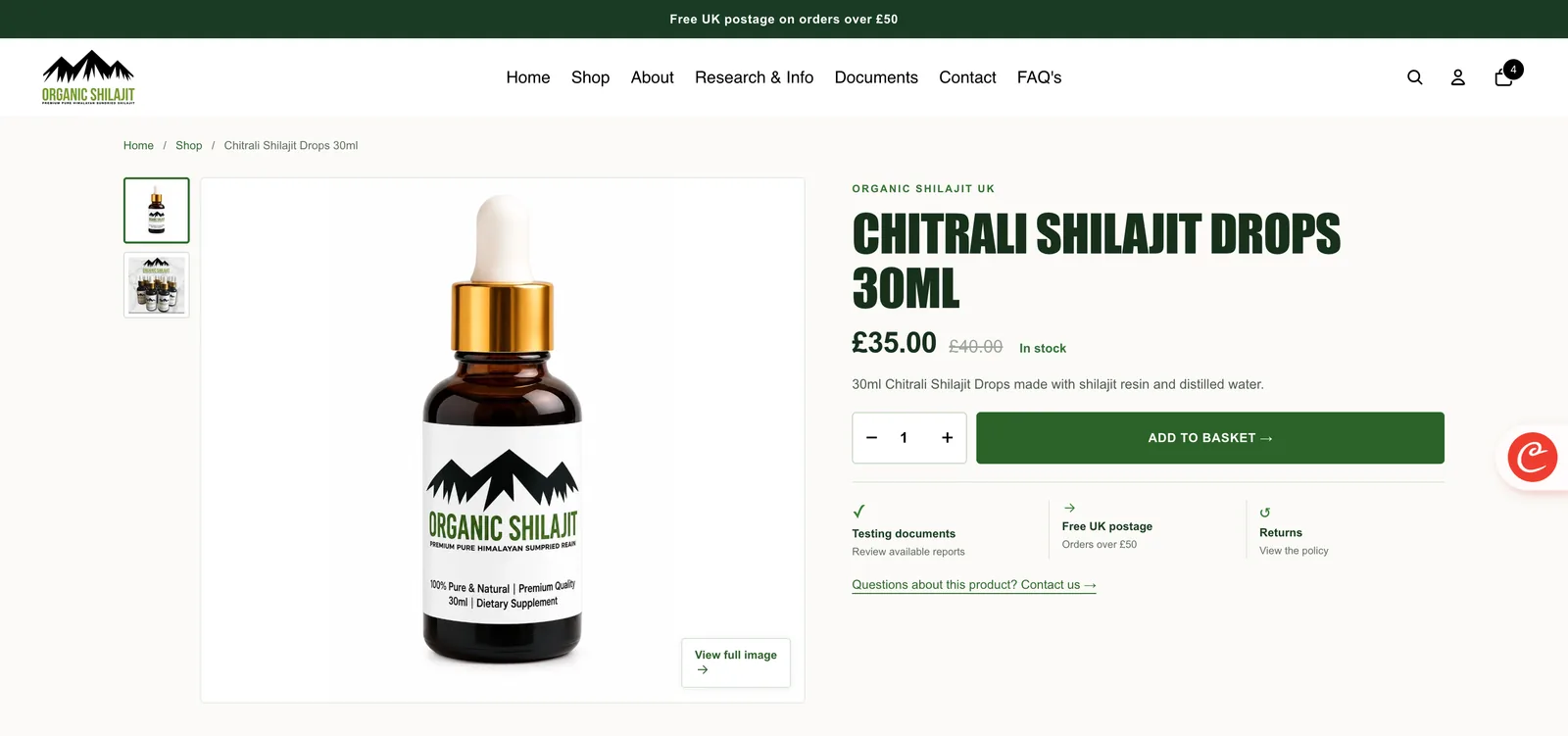
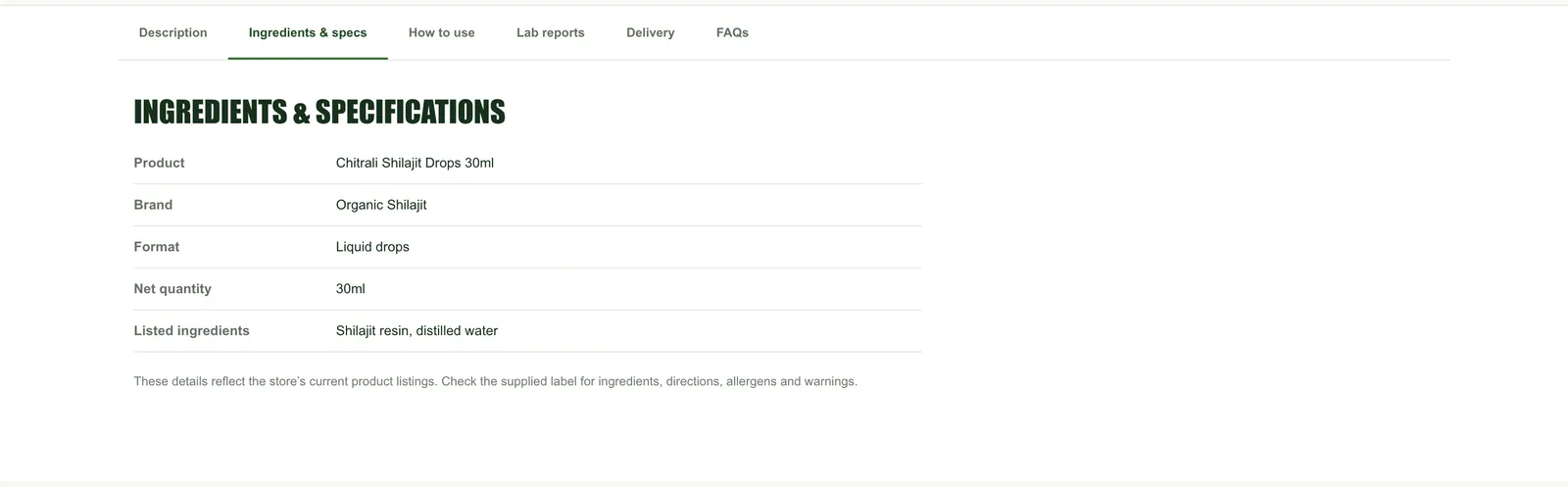
What changed on product pages
More detail, less noise.
- Breadcrumbs and a clear title. Customers always know where they are and can step back to the shop.
- Price, saving and stock together. The was price, the current price and In stock sit next to each other.
- One main button. Add to basket is the single main action, with the quantity next to it.
- Trust points by the button. Testing documents, free UK postage over £50 and the returns policy, where people decide.
- Proper product information. A specification table with product, brand, format, quantity and listed ingredients, plus how to use, lab reports, delivery and FAQs.
- Careful wording. Health-benefit headlines were replaced with factual product information and a reminder to check the label, which suits the rules on how food supplements can be described.
Across the store
The same care on every page.
- A new theme and layout. A clean, modern look carried across the homepage, shop, product, about, research, documents, contact and FAQ pages.
- Mobile first. Layouts, buttons and product options rebuilt for a phone, where many shoppers browse.
- On-site SEO. Page titles, descriptions, headings and product information updated across the store so each page says clearly what it is.
- Better imagery. Product shots and section images refreshed where possible so the range looks consistent.
- A tidier footer. Shop and help links, payment methods and policies, all easy to find.
How we did it
The process.
- Review the storeWe went through the shop as a first-time customer and listed every question it left unanswered.
- Plan the structureWhat each page needs to say, in what order, and which products and sizes belong together.
- Design and build the themeA new Shopify theme built mobile first, with the homepage and product pages done before the rest.
- Content, SEO and checksProduct information, page titles and imagery updated, with iterative mobile and desktop reviews of the important shopping journeys.
The thinking behind it
Why trust came before decoration.
Shilajit is a product many people are buying for the first time, often after reading conflicting claims online. Our working hypothesis was that specific, accessible information would earn more trust than louder claims or decorative features.
So the redesign puts the facts people look for, sourcing, testing, ingredients and delivery, within one tap of every product. Fewer, clearer choices make it easier to buy, and fewer bold claims make the brand easier to trust.
What we can evidence
A clearer store, without invented conversion figures.
The published storefront shows the new, product-led first screen and accessible sourcing and testing information. The comparison images document design decisions, and the live store may have evolved since those captures. This is evidence of the design and implementation work, not proof of a particular sales uplift.
The commercial questions we tackled
- Product choice: make the available formats and sizes easier to understand before entering the cart.
- Trust at purchase: put verifiable product facts and available documents near the product decision rather than relying on health claims.
- Mobile usability: reduce competing actions and make the purchase route easier to follow.
- Operational accuracy: keep pricing, availability and product details consistent with the actual catalogue.
See the live store Get a free review of your store
The ecommerce decision
A product page should resolve uncertainty before demanding an order.
Organic Shilajit UK is a useful example of a specialist store where shoppers may not know how formats, quantities and sourcing evidence relate. The design work prioritised clear catalogue choices and access to verifiable product information. That is not the same as claiming a health benefit or a measured conversion improvement.
| Question shoppers may have | Design decision | Quality check |
|---|---|---|
| Which size or format should I choose? | Present genuine variations together where the underlying product is the same | Size, price and availability update correctly when options change |
| What exactly am I buying? | List the format, quantity, origin claims and relevant specifications | Details agree with the current product label and stock data |
| What supports the quality statement? | Make relevant evidence accessible, rather than using vague badges | Documents are genuine, current and accurately described |
| What happens after checkout? | Show applicable delivery, returns and contact details near purchase | Policies match the actual merchant process |
| Will it work on my phone? | Keep the purchase action prominent without hiding product details | Test variant selection, basket and checkout on a real phone |
The existing before-and-after screenshots show the visual and information changes. They should be treated as dated captures; a live Shopify store can change after a case study is produced.
Behind the interface
The same product information has to survive every system.
Storefront design and catalogue accuracy are connected. When products have formats or variants, the selected option needs a coherent product title, price, availability, images and any relevant identifiers across the Shopify product page, checkout and advertising feeds. A visual redesign that leaves those relationships broken risks creating a worse customer experience.
| Layer | What to inspect | Failure to avoid |
|---|---|---|
| Collection | Product grouping, filtering and clear item names | Near-identical products occupying the whole first screen |
| Product | True variants, quantity, price, evidence, delivery and availability | A size selector that doesn't update the selected offer |
| Basket | Selected option, costs and discount application | Different variant or surprise price at checkout |
| Merchant Center feed | Variant identifiers and exact landing-page information | Submitted offer contradicting the destination page |
| Tracking | View item, add to basket, begin checkout and purchase events | Assuming more page views means more sales |
These checks are a professional QA framework, not a claim that every one was implemented as an integration for this client. See our Merchant Center and product data consultancy for the wider technical process.
Outcome and evidence
What the redesign demonstrates and what remains unknown.
The available screenshots document a change from a broad promotional first screen to clearer product choices, more meaningful specifications and accessible sourcing and testing information. Those are observable interface outcomes. Without access to a validated before-and-after analytics series, we cannot attribute changes in revenue, conversion rate or search rankings to the work.
A meaningful commercial evaluation would segment new and returning users, mobile and desktop sessions, product discovery, variant selection, basket completion and the relationship between traffic source and orders. It would also account for pricing changes, campaigns and product availability over the same period.
Transferable lesson: credible ecommerce design is not about adding more trust badges. It is about making legitimate, useful evidence available at the precise point a shopper needs to decide.
Next step
Is your website pulling its weight?
Get a free review.
Send the URL. You get a clear Keep, Fix or Rebuild recommendation and the first three changes we would make, with no obligation.
Get a free website review