Trades website · Hertfordshire
Aflow: a plumbing website built for urgent enquiries
A live Hertfordshire plumbing and heating website designed around emergency calls, easy quotes and clear routes into the right service.
Free first review · Practical recommendations · No obligation
Project at a glance
- The problem
- Serve urgent plumbing calls and planned-work enquiries from the same website.
- What we delivered
- Responsive service pages, coverage information and separate call and quote routes.
- Key decision
- Put emergency contact and service selection ahead of general company copy.
Live client project · Hertfordshire trades
For an emergency plumbing visitor, the decision is immediate. Can this business help, does it cover my area, and how quickly can I make contact? The site puts those decisions before a long company story.
The commercial problem
Visitors with a leak don't want to study a brochure.
Trade websites need to make urgency, availability, area coverage and the right next step obvious. Aflow presents plumbing and heating work across Hertfordshire, including emergency call-outs and planned services.
The design therefore gives the phone number and free quote separate jobs. Emergency visitors can call; people planning work can request a quote.
- A direct 24/7 emergency call route at the top
- Clear plumber and heating service categories
- Area coverage and trust cues close to the enquiry action
- Strong mobile call and WhatsApp access
- Desktop and mobile layouts designed for different viewing contexts
Desktop and mobile
One proposition. Different screens.
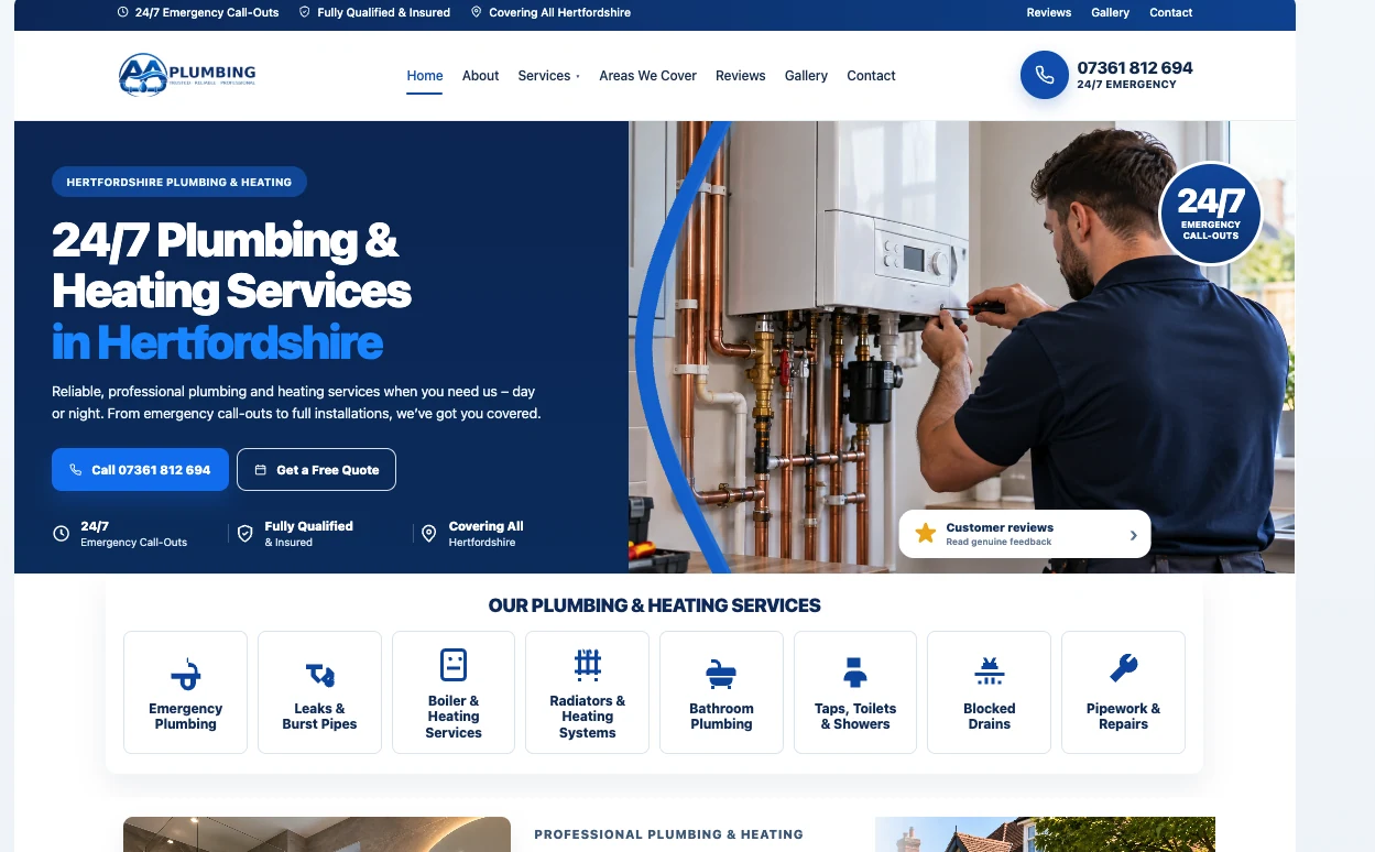
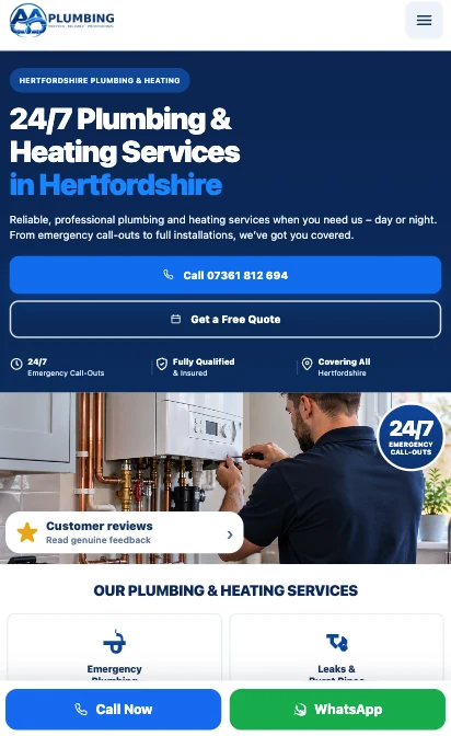
These are the actual desktop and phone screenshots supplied for this project, not visual mock-ups invented for the case study. Select either image to inspect its full size.
Decisions behind the design
Built for what people need in the first ten seconds.
01. Answer the emergency
Prominent phone access is more important than asking a stressed customer to complete a long form. The hero communicates service type, coverage and availability at a glance.
02. Show the breadth without burying the essentials
Separate cards cover emergencies, leaks, boilers, heating, bathrooms, blocked drains and pipe repairs. Visitors can recognise their problem and choose the relevant route.
03. Build confidence without fake evidence
Visual service proof, area messaging and access to reviews support the decision to contact. The visible claims belong to the plumbing business; independent qualifications and customer ratings are not being asserted by FifteenFold.
04. Make small screens intentional
Desktop has room to show the engineer and service navigation side by side. Mobile prioritises readable copy, two immediate actions and an accessible fixed contact route.
Another approach to trades
The trade is the same. The website needn't be.
Our Brightline plumbing demonstration explores a different trades website direction, with its own messaging, layout and enquiry journey. Brightline is shown as a design exploration, not a second Aflow client or a verified live commission.
What this demonstrates
A clearer route from a plumbing problem to a call.
The supplied screens and public site show design and implementation decisions, not a measured increase in enquiries. The next step in a real CRO review would be to compare mobile call clicks, quote starts and completed enquiries over a defined period.
Experience design for trades
Emergency calls and planned work are not the same conversion.
An urgent leak creates a different customer decision from a planned bathroom or heating project. Both visitors may arrive through Google, but measuring them as one generic “lead” hides important differences. Aflow's supplied screens show call and quote routes, and we use that distinction to explain the design approach.
| Decision | Emergency visitor | Planned-project visitor |
|---|---|---|
| What they need first | Trade, location, stated availability and direct contact | Relevant service, scope, examples and quotation process |
| Primary action | Phone or immediate contact | Request a quote or describe the job |
| Supporting evidence | Truthful availability, area coverage and business details | Photographs, qualifications where verified, service scope and response expectations |
| Measurement | Meaningful call clicks and answered enquiries, not just page views | Quote starts, completed submissions and qualified projects |
The preferred action should follow the visitor's urgency. That is a better design decision than forcing every visitor into a long, multi-step contact form. A site must not claim 24/7 attendance simply because a design mockup happens to show it; operational availability must reflect the real business.
Desktop and mobile review
How we assess the finished screens.
The two Aflow screenshots already shown above are project evidence. They illustrate a desktop first screen with service messaging and immediate actions, and a narrower mobile layout where call and quote choices remain near the top. Those are visible design observations, not measurements of traffic or booking uplift.
| Area | Desktop review | Mobile review |
|---|---|---|
| First screen | Can the service, area and action be scanned together? | Does the core promise remain legible without decorative content pushing the CTA down? |
| Contact controls | Are call and quote options clearly differentiated? | Are the tap targets usable and clear of other fixed controls? |
| Service coverage | Can a planned-work customer reach a service detail page? | Is the navigation short and usable one-handed? |
| Trust | Are images and claims attributable to the actual business? | Can visitors verify details without lengthy scrolling? |
Practical regression tests: test navigation at 320px and 390px, the telephone link, any WhatsApp handoff, form validation, spam protection, success message and actual notification email. Avoid counting a button click as a confirmed customer contact.
What this case teaches
Don't sell the builder. Solve the customer's moment.
A tradesperson doesn't need a sophisticated animation if the visitor cannot tell whether the service is available in their area. Equally, a generic one-page brochure may fail to give planned-project customers enough information to commit. The correct approach is to distinguish urgency, decision time and evidence requirements, then organise the content around them.
The Aflow case proves the website presentation and the specific decisions documented by the supplied screens. A responsible case study also identifies what remains to be measured: answered calls, relevant quote requests, lead quality and the business's operational response. We have not added fictional testimonials, staff profiles or measured commercial results.
Next step
Is your website pulling its weight?
Get a free review.
Send the URL. You get a clear Keep, Fix or Rebuild recommendation and the first three changes we would make, with no obligation.
Get a free website review