

Problem-led treatment choices and a body-area finder help first-time visitors decide what to explore.
Case study
Herts Cupping
From the first treatment question to a confirmed booking. A responsive clinic website designed around discovery, clear prices, staff-aware appointments and local search.
Free first review · Practical recommendations · No obligation

THE THINKINGMake it easy to understand the treatment, compare the options and book without unnecessary steps.
Project at a glance
- The problem
- Help new and returning visitors choose a treatment and find a suitable appointment.
- What we delivered
- Treatment discovery, clear pricing, staff-aware booking routes and local service content.
- Key decision
- Connect treatment guidance and price comparison to the booking journey.
The experience
Designed for the questions customers actually ask.
Someone new to therapy needs guidance. Someone returning knows what to book. The website supports both journeys, with the same clear routes on mobile and desktop.
Clear service lengths, prices, inclusions and follow-up information reduce uncertainty.
A customised booking journey supports appointments across the clinic's staff and service options.
On-page SEO, service relevance and mobile-first internal journeys connect search intent with an enquiry.
For new and returning visitors
A decision guide, not a wall of treatment names.
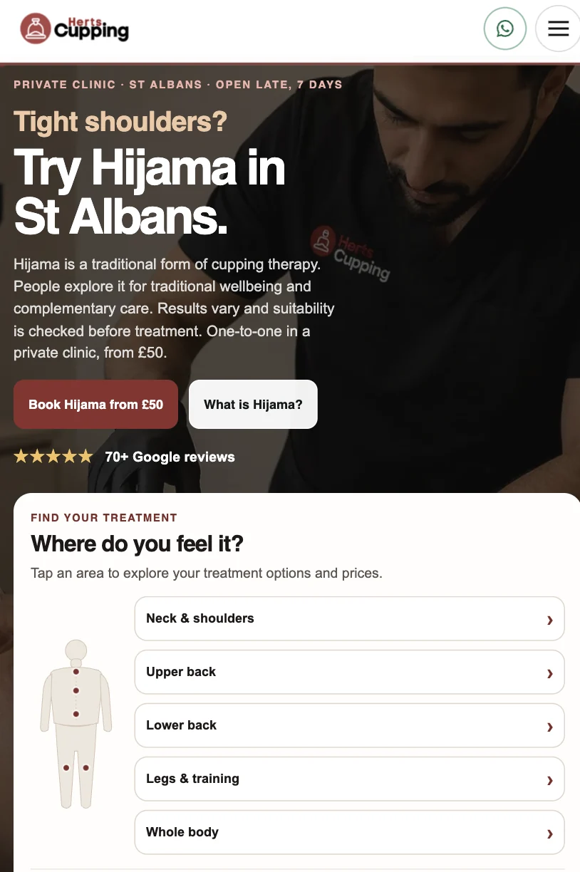
Visitors can start with a body area, explore an appropriate service and see what's involved. New visitors also have a short guided route when they are unsure where to begin.
01
Find your treatment.
On mobile, a simple body-area selector helps people navigate by what they feel, with routes for neck and shoulders, back, legs or whole-body sessions. The wording encourages exploration, without turning the website into a diagnosis.
Clear first-time explanations give Hijama newcomers context before they choose a session or contact the clinic.
- Body-area and problem-led entry points
- Short explanations for first-time visitors
- Direct movement from guidance to service or booking
Services and pricing
Show the offer before asking for a booking.
The service cards display session type, duration, price, what is included and the action to take. Visitors can compare a targeted treatment with a full-body option or a first-time Hijama session.
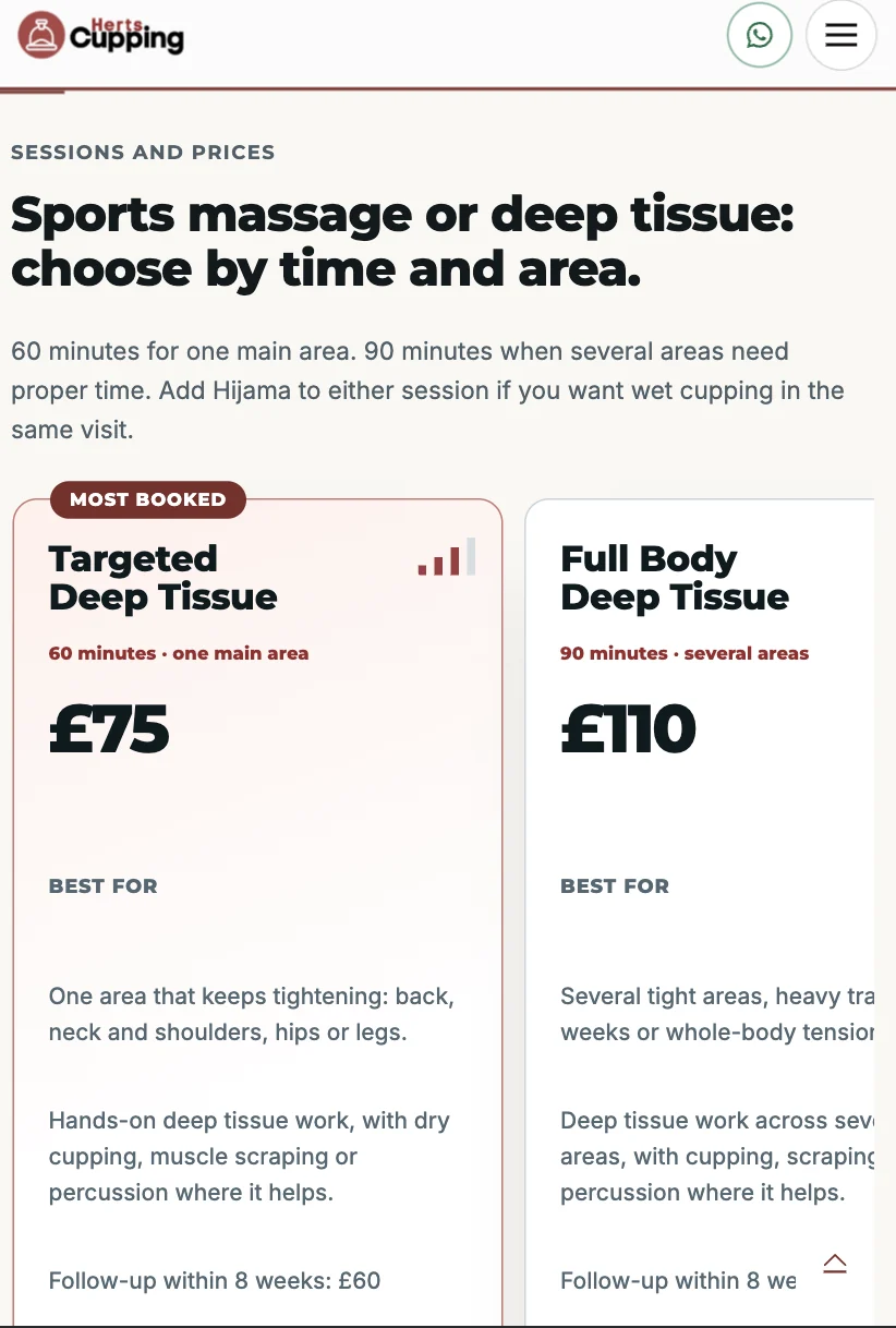
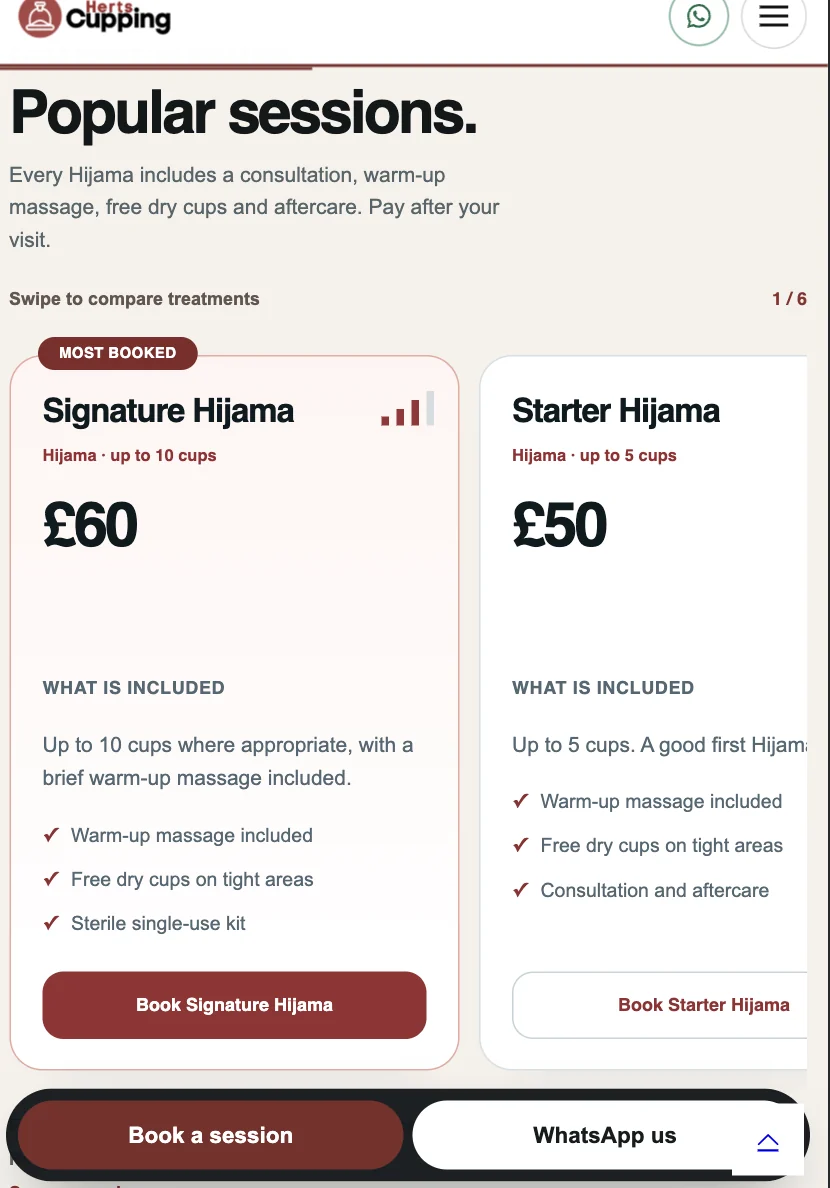
Pricing is presented as part of the decision journey, so visitors can choose the right session rather than encountering unexpected details at the point of contact.
Appointment experience
02A booking flow designed around the clinic's staff and treatments.
Instead of sending every enquiry through an unstructured contact form, the booking journey brings treatment choice, availability and appointment timing together.
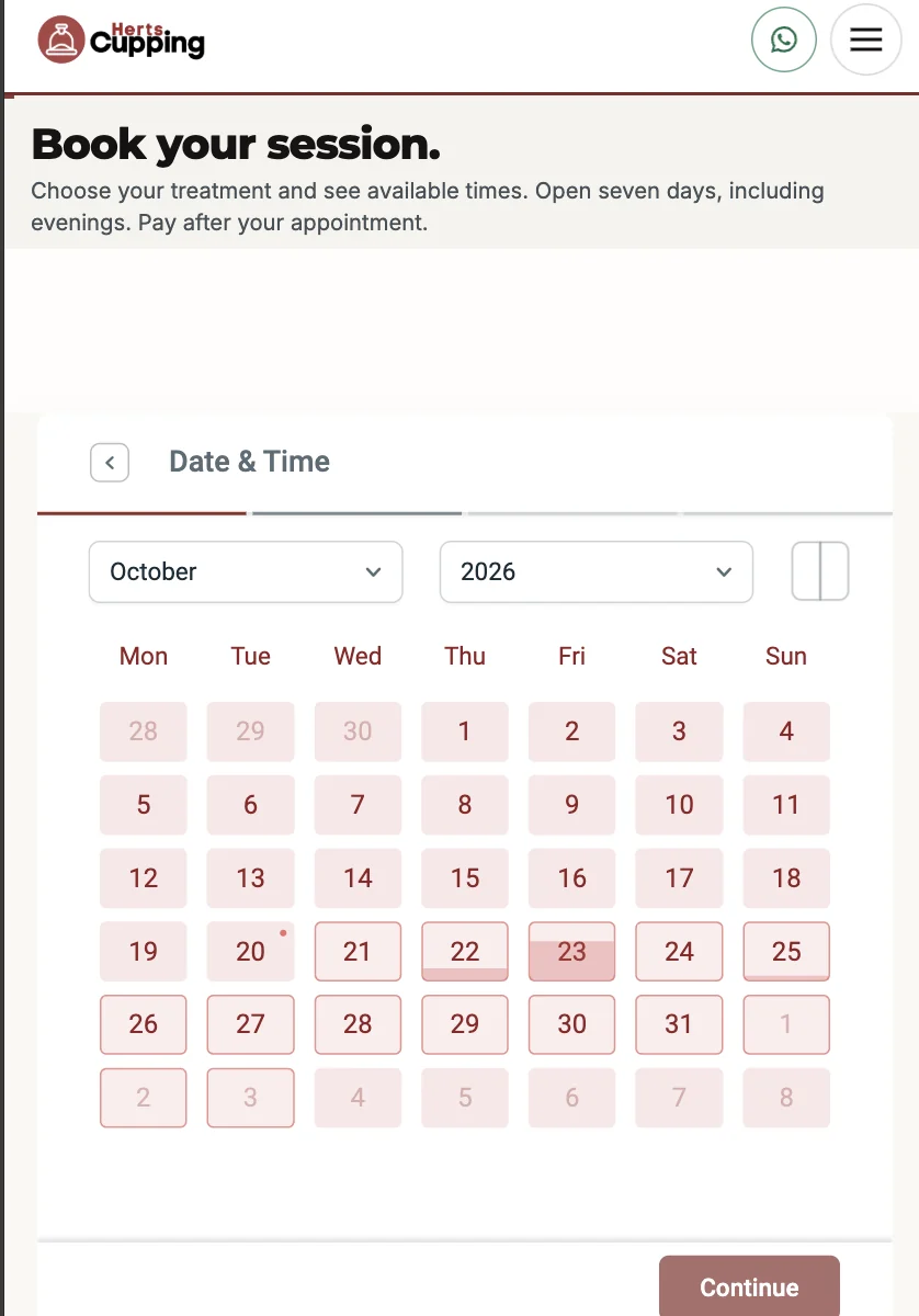
The custom appointment form supports different clinic staff and treatment routes. Clear steps and a visible calendar make the next action easy to understand on a phone.
- Service-led booking entry points
- Staff-aware appointment workflows
- Mobile calendar with available date choices
- WhatsApp and phone routes for questions before booking
The screenshot illustrates the calendar stage. The clinic manages actual staff schedules and availability within its booking setup.
Search visibility and mobile UX
Designed to be found, understood and used.
Search relevance is built into the structure, not added as an afterthought. The mobile journey is treated as the primary route to an appointment.
Relevant service pages
Clear page topics and service descriptions support searches for Hijama, cupping and massage in St Albans, with related information linked meaningfully.
On-page SEO foundations
Page titles, structured headings, internal links, local context, image descriptions and crawlable service content are organised for search discovery.
Mobile-first decisions
Touch-friendly treatment cards, legible price comparisons, prominent booking and WhatsApp actions, and straightforward navigation support the whole mobile journey.
Desktop clarity
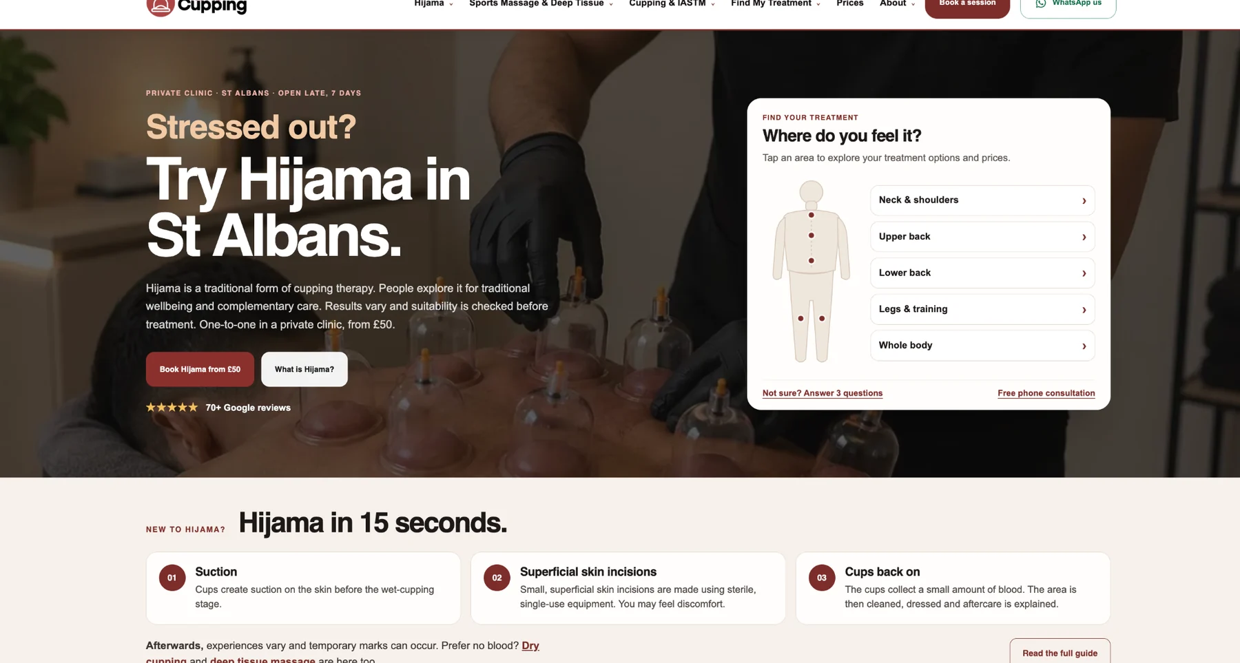
A considered first screen pairs the service proposition with the treatment selector; wider layouts make navigation, credibility and service discovery easier to scan.
These are documented implementation and optimisation decisions. The screenshots do not establish a numerical increase in bookings or a particular Google ranking.
What this demonstrates
More than a clinic homepage.
One connected digital experience spanning discovery, education, treatment comparison, staff-aware appointment bookings, mobile conversion and local search.
Next step
Is your website pulling its weight?
Get a free review.
Send the URL. You get a clear Keep, Fix or Rebuild recommendation and the first three changes we would make, with no obligation.
Get a free website review