Hayati Essence: from catalogue to considered commerce.
A before-and-after look at the redesign direction for a fragrance and wellness retailer. We have focused on product discovery, a consistent visual identity and clearer choices from collection to checkout.
Free first review · Practical recommendations · No obligation
Project at a glance
The problem
Help fragrance shoppers navigate collections and compare product choices.
What we delivered
A redesign in progress across homepage, collections and product pages.
Key decision
Connect fragrance storytelling with useful filters and product information.
Project status: redesign in progressThe new screenshots are design/build previews. They are not evidence of a completed public launch or measured sales uplift.
Make the products feel as considered as the brand.
Perfume oils, bakhoor and natural wellness products needed a more cohesive customer journey. The original store was functional, but product selection and brand presentation felt disconnected.
Clearer category navigation and visual identity
Filterable fragrance collections and selectable sizes
Consistent imagery and product cards
Product-page hierarchy, trust and checkout clarity
Mobile-first priorities and repeatable design patterns
The work in context
Three journeys. Six real screenshots.
Compare the supplied original screens with the new design previews. Open any screenshot to inspect the full page.
01 / Homepage
Give the brand a distinctive first impression.
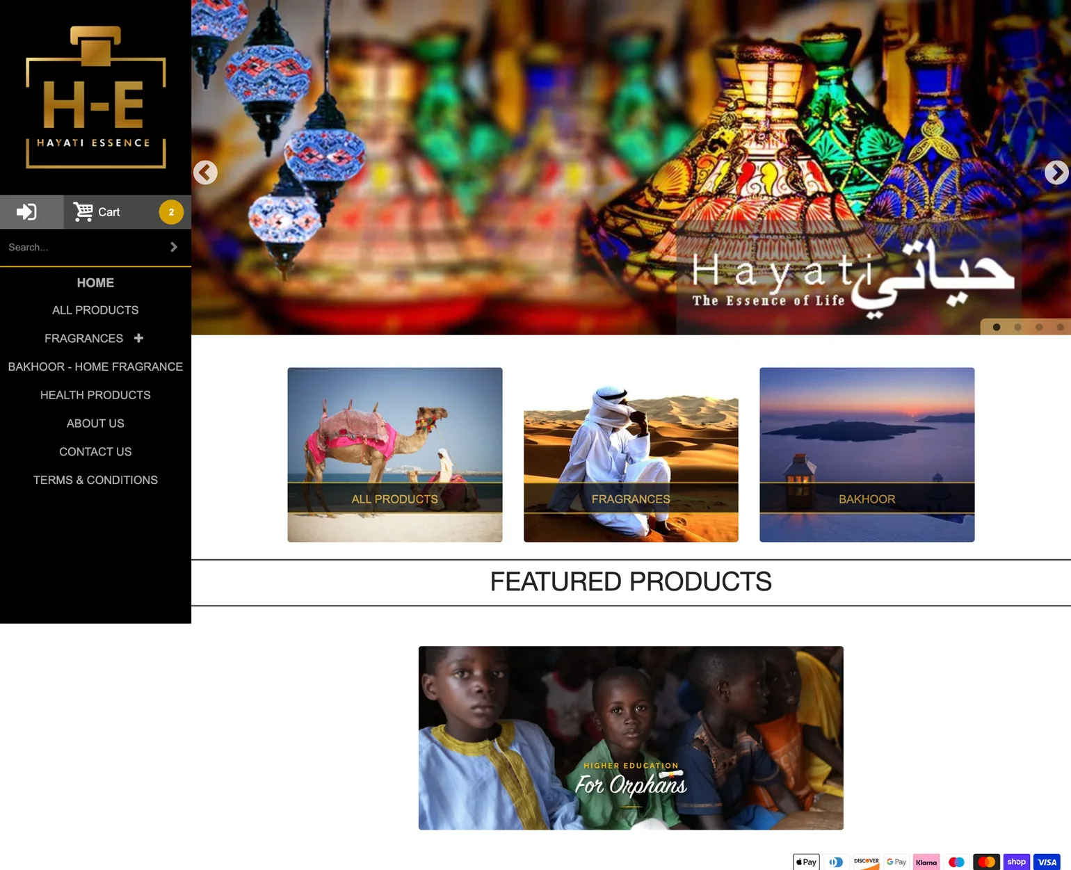
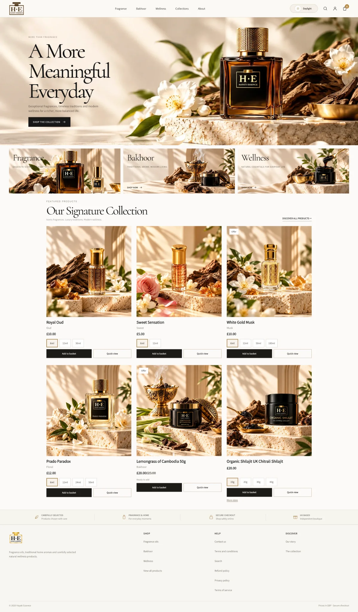
The previous layout used a large image carousel and generic category tiles. The proposed homepage brings fragrance, bakhoor and wellness into a calm editorial system, with clear paths into shopping and consistent product photography.
Design decision: A clear proposition, immediately visible collection routes and deliberate space around featured products.
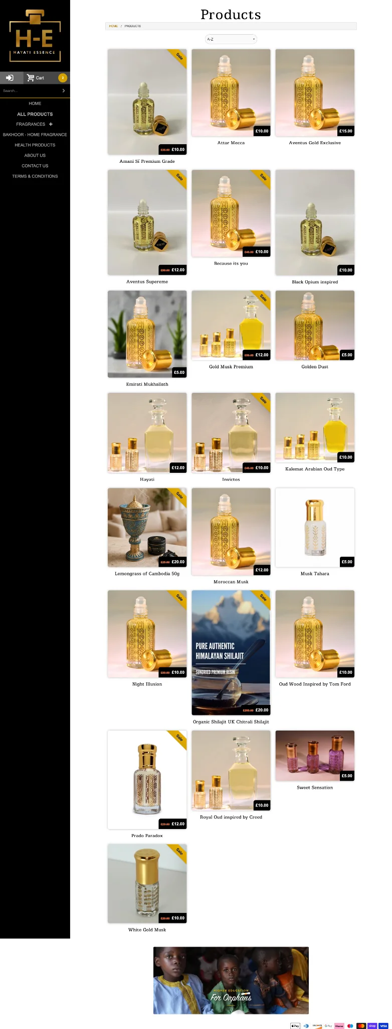
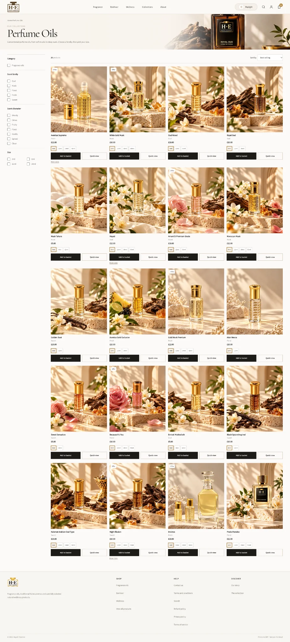
The old product grid relied largely on a sort menu, repeating cards and a fixed side navigation. The new design introduces category, scent-family, character and size filters beside a more consistent product grid.
Design decision: A more deliberate browse-and-compare journey, including visible size options, quick view and add-to-basket routes.
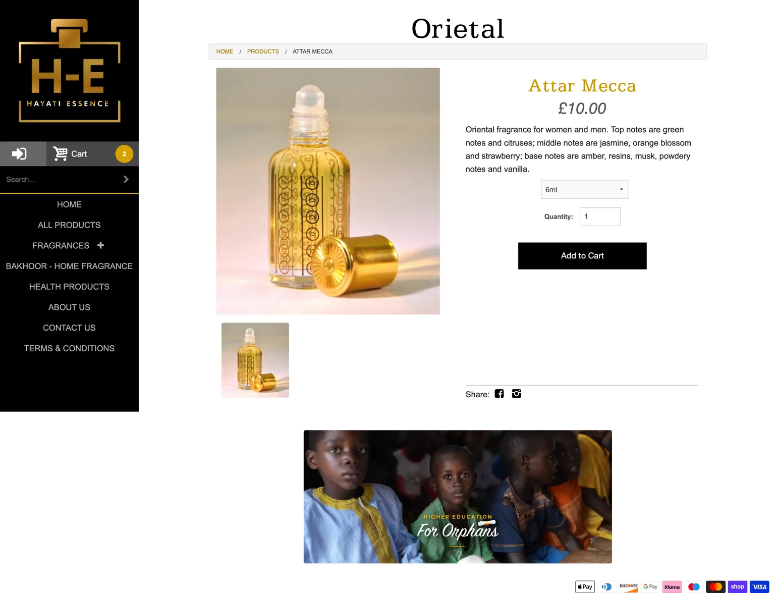
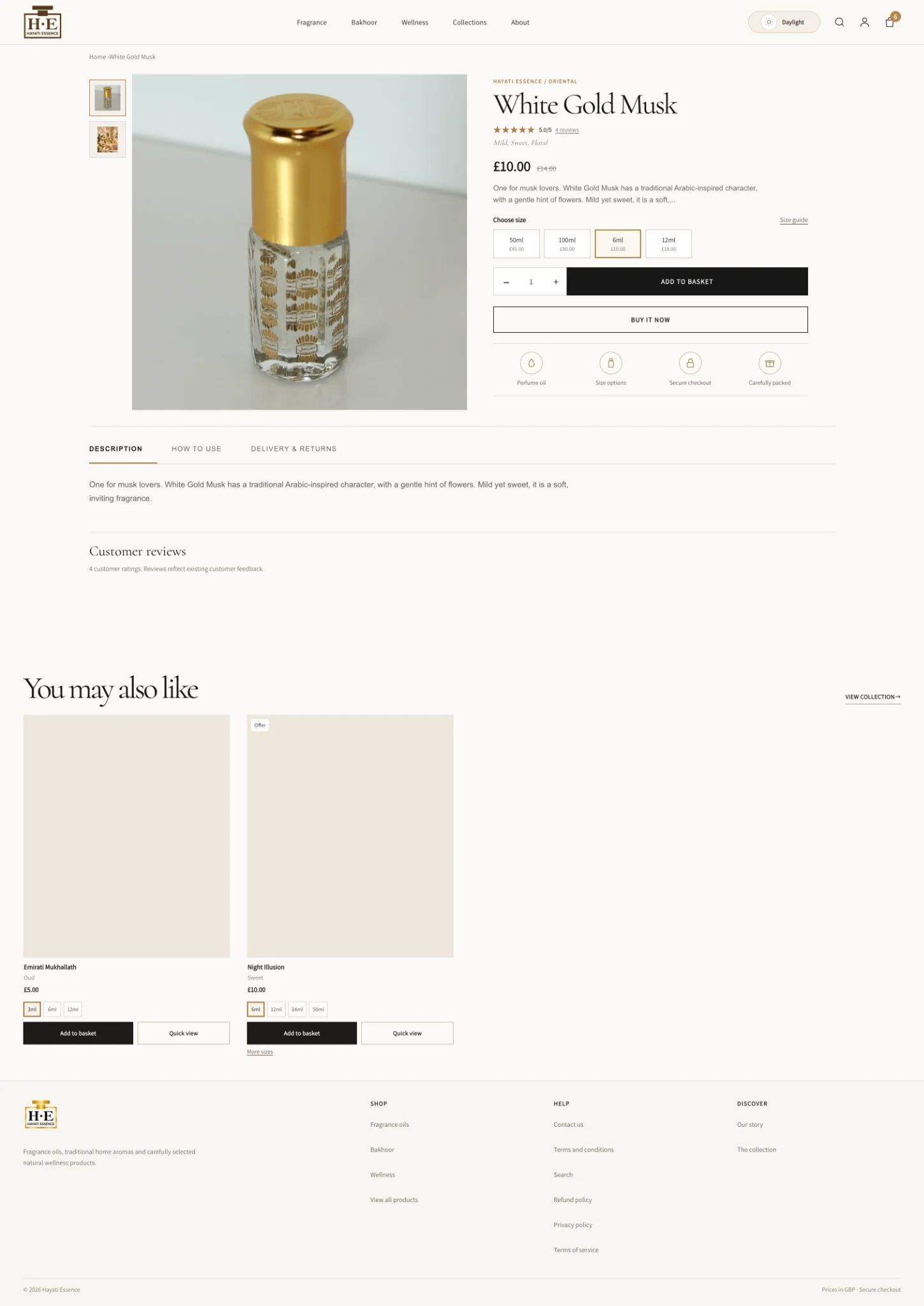
The original product page had a basic image, a variant dropdown and a small amount of explanatory text. The new design groups imagery, selected size, price and purchase actions, then makes product information, delivery and reviews easier to find.
Design decision: Clear size choices, purchase hierarchy and supporting product information without overloading the initial screen.
Not a template swap. A better route through the store.
Work has involved revisiting photography, information hierarchy, filtering, variations and consistency across the homepage, collection pages and product pages. Each design choice should help visitors understand the product and take the next step with less uncertainty.
Measured performance: no conversion, ranking or sales uplift is claimed at this stage. The redesign requires final client approval, launch and real data before results can be reported.